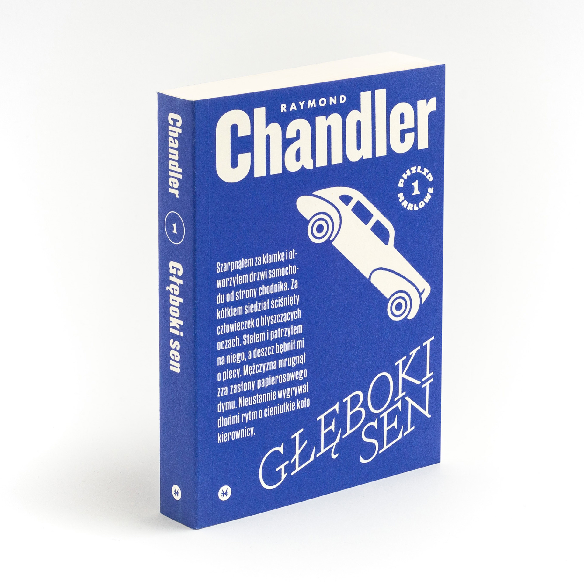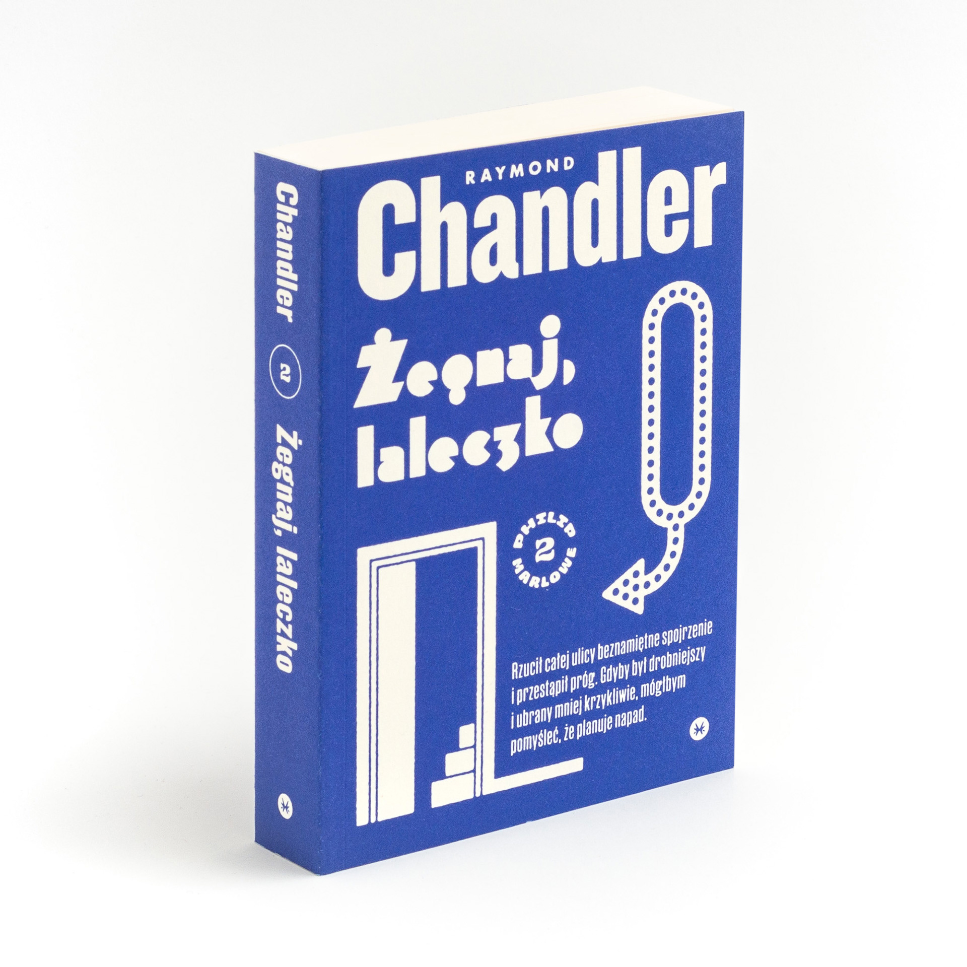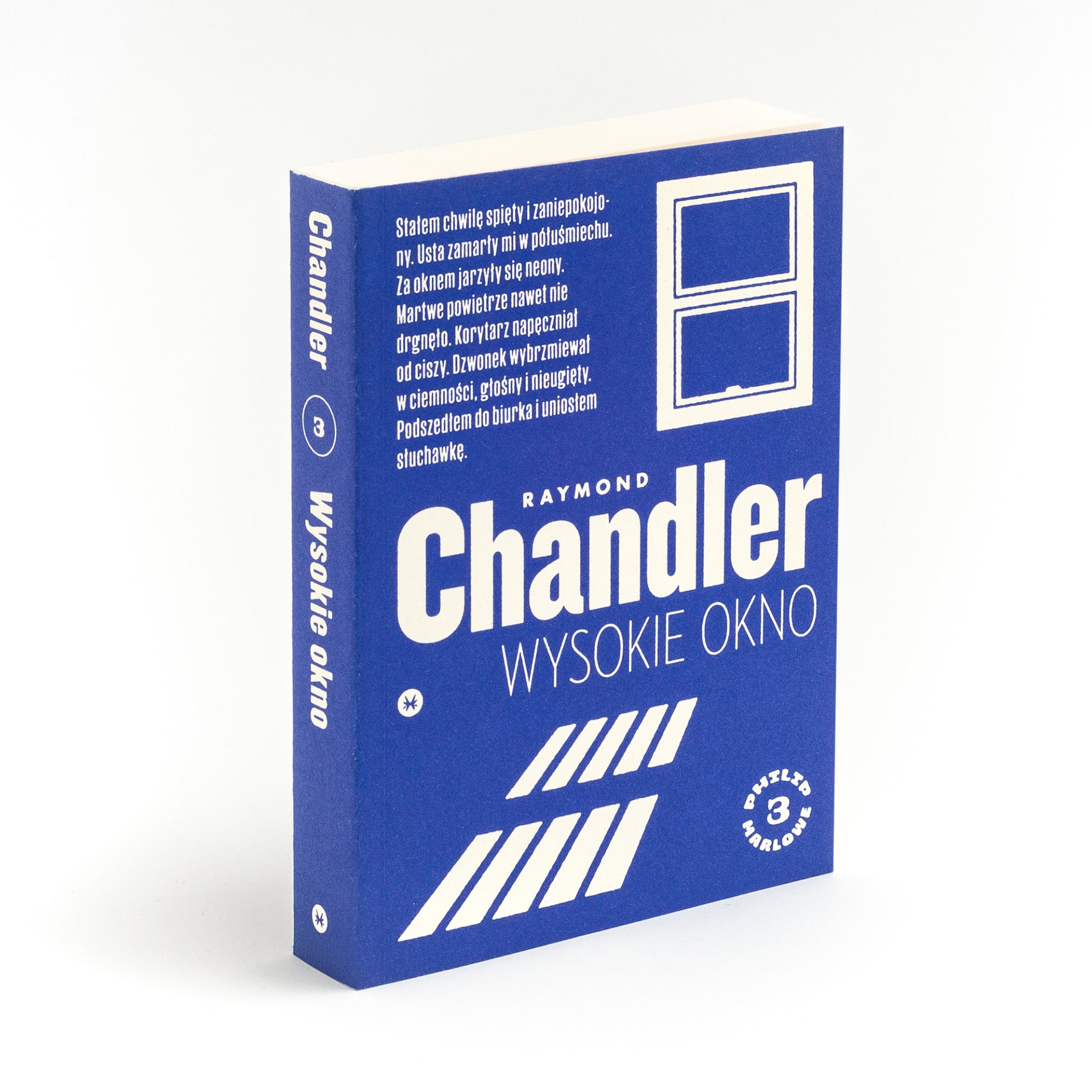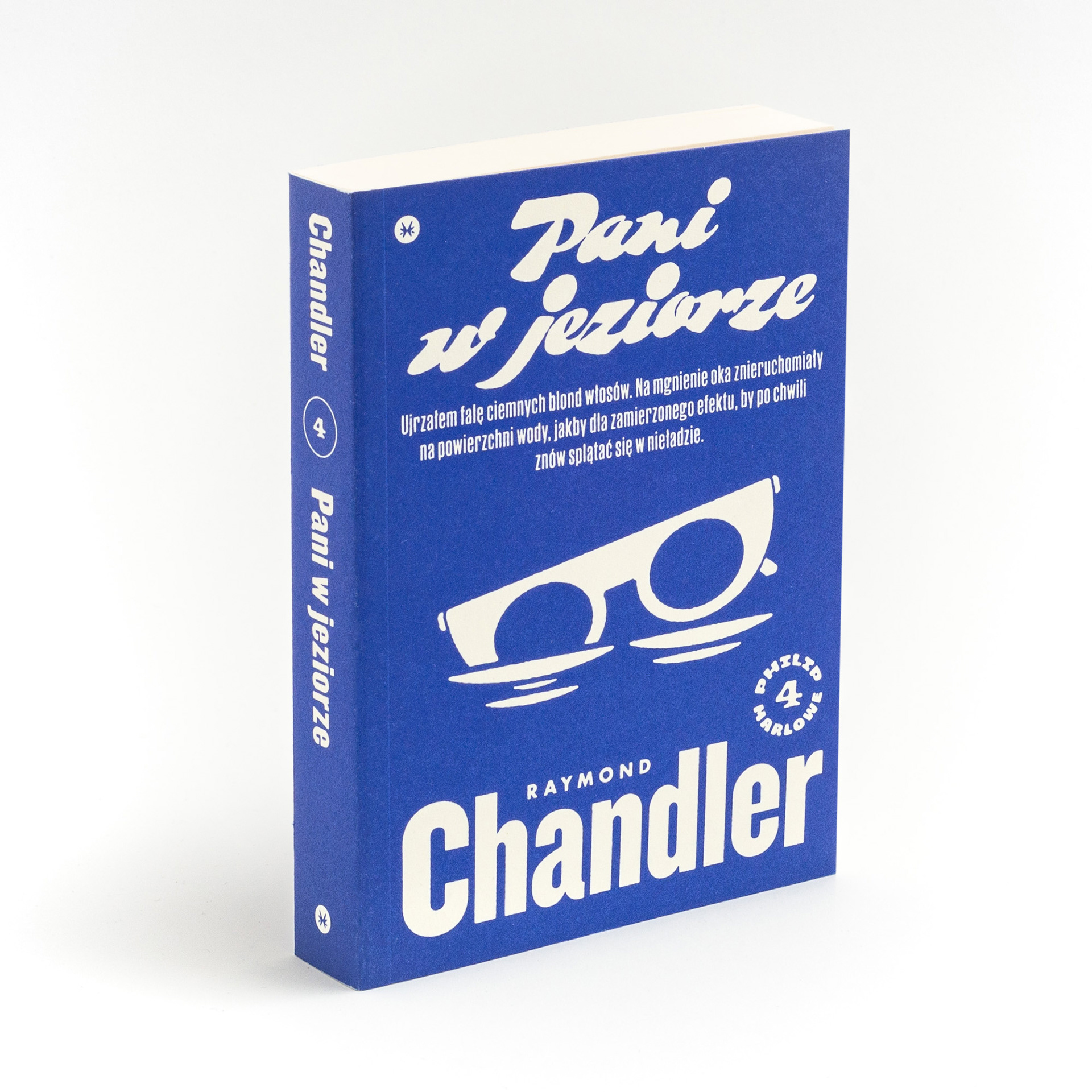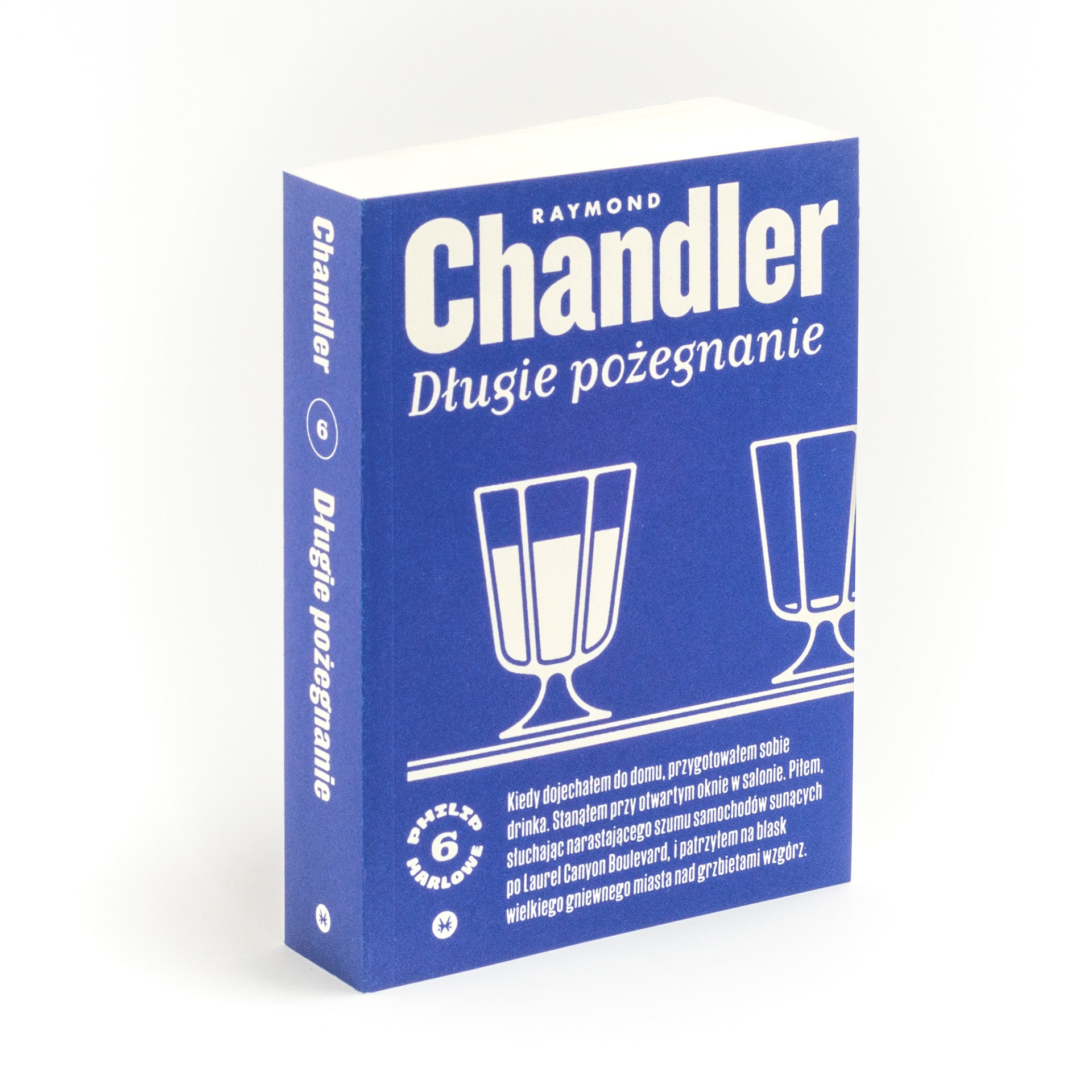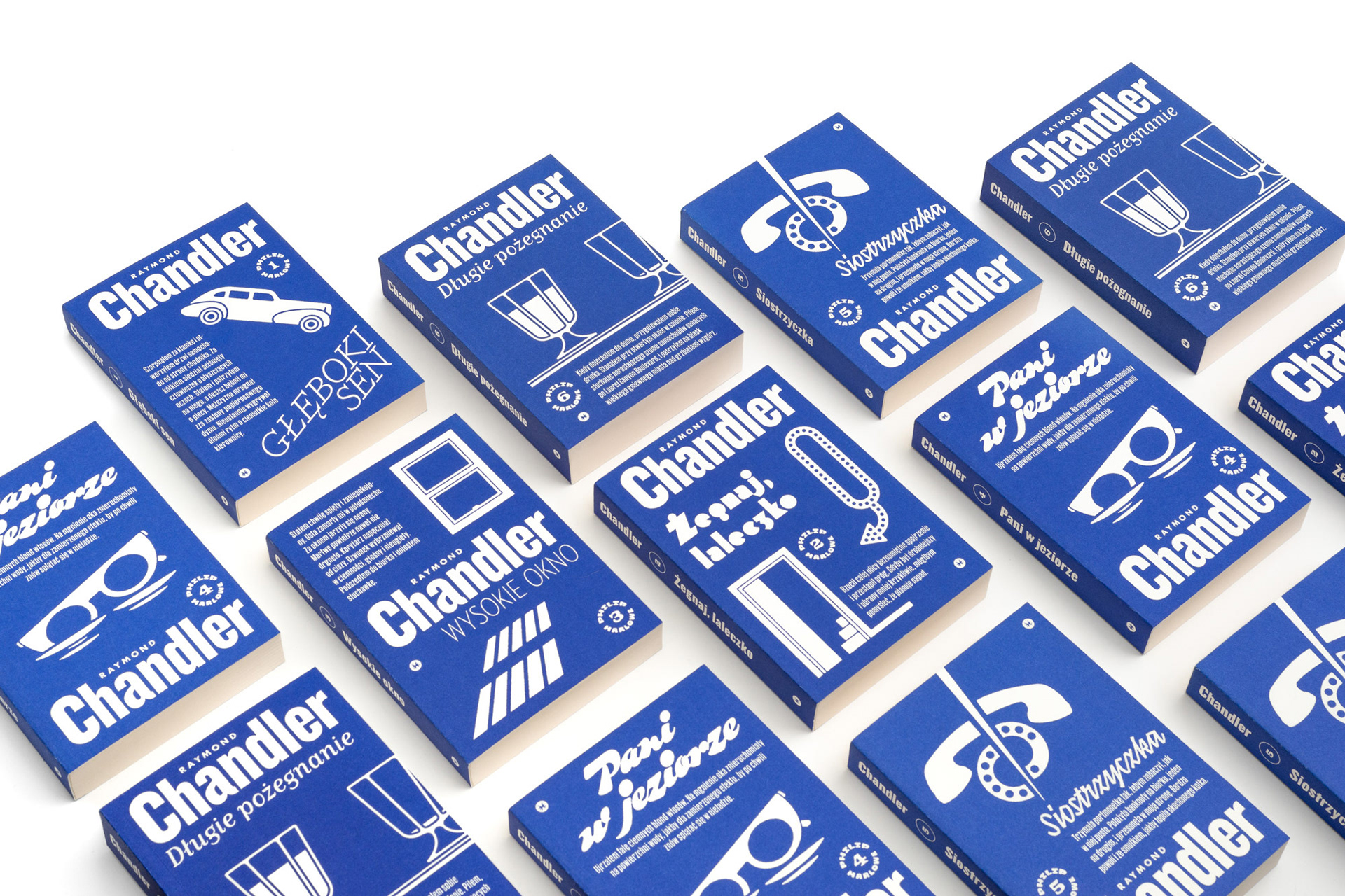
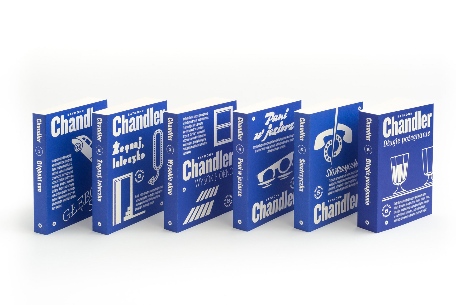
I was so delighted to receive The Most Beautiful Polish Book Award for the series, because I really put my heart and soul into this project. One year earlier I came across The Smiley Collection, a new series of John le Carré books designed by David Pearson. The typography and colours were just right. With very limited means, Pearson managed to evoke the atmosphere of a bygone era, and I thought I’d like to do something similar with Chandler.
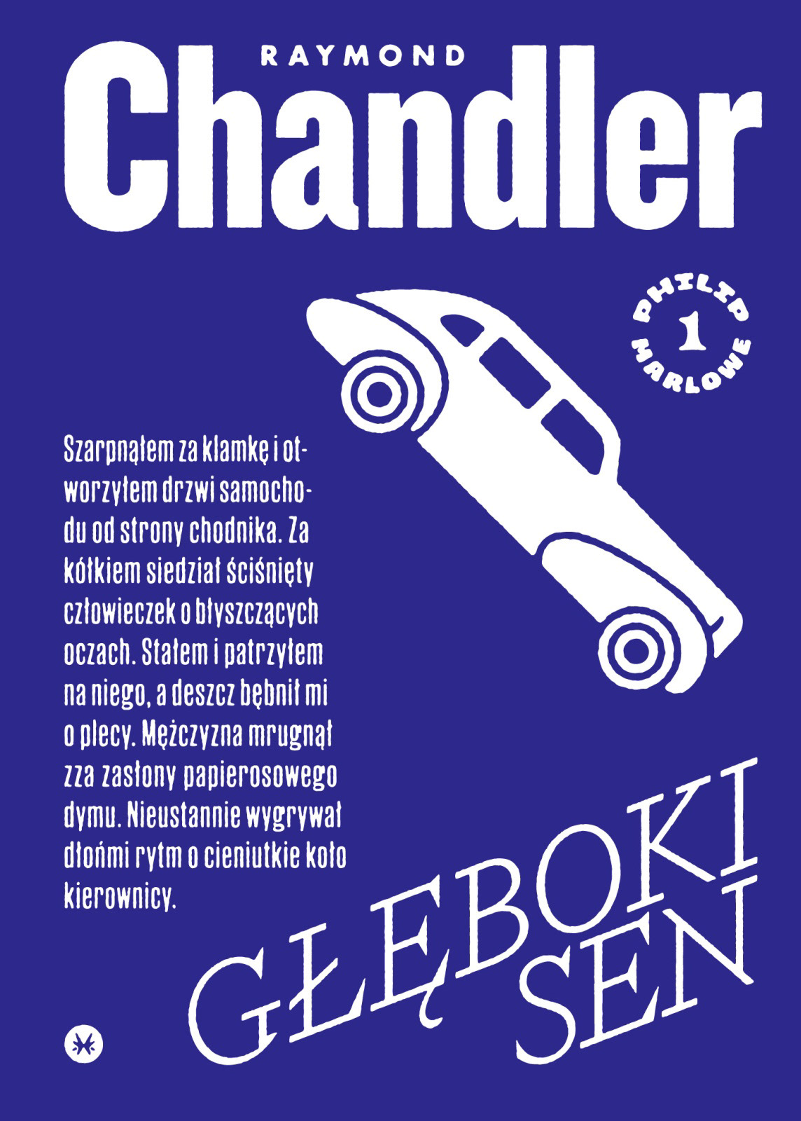
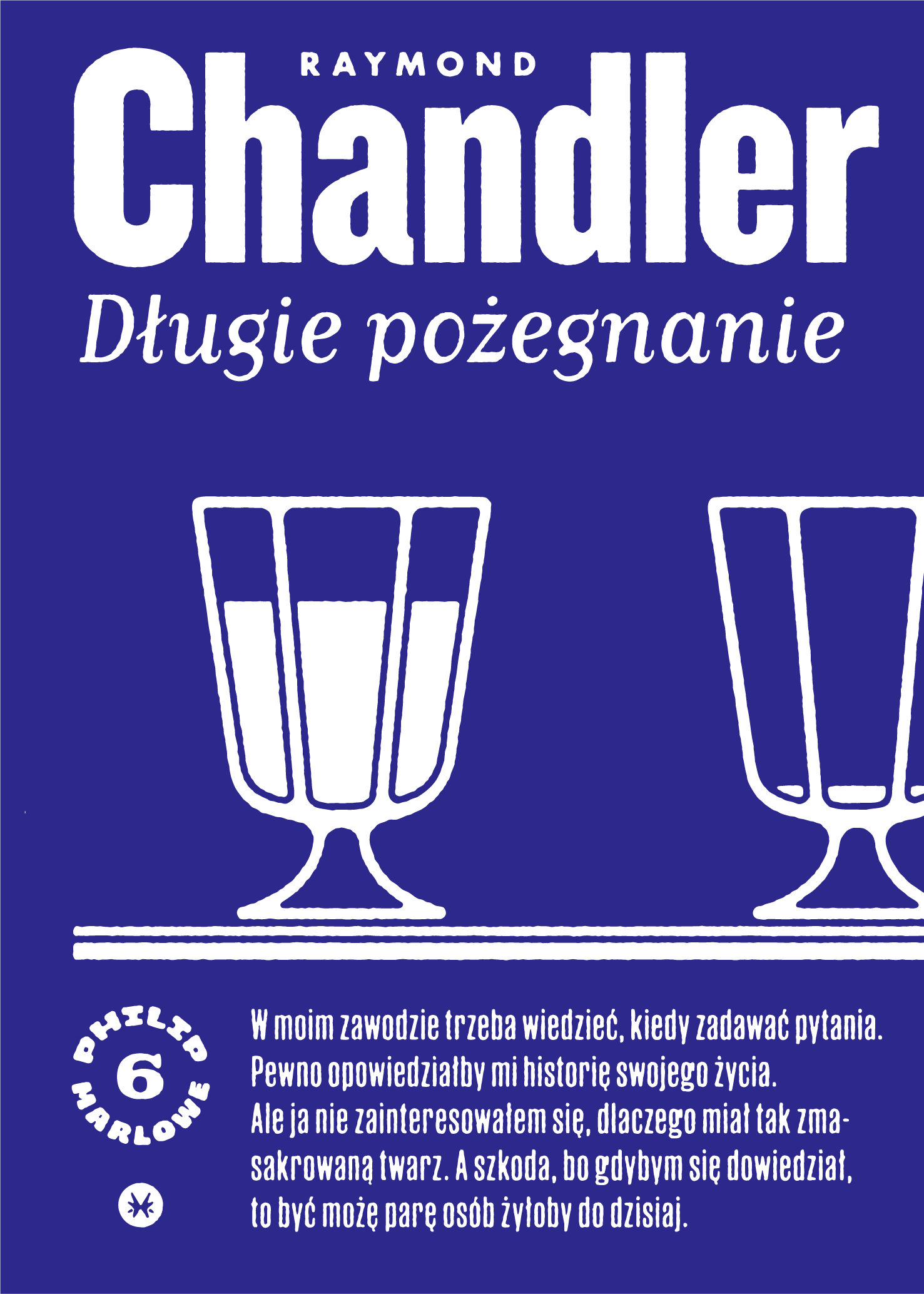
I first read his books in the Polish communist-era editions of the "Z jamnikiem" series. Wonderful paperback designs from the days of the shortage economy! The glue crumbles, so most of them are now in tatters. Monochrome covers, the obligatory snippet of the novel’s text on the front, an unusual squat format: I folded all of that into my own design.
I spent hours watching film noir title sequences from the 1940s. The craftsmanship of Hollywood letterers is striking: I loved the sheer variety and inventiveness of the lettering. I knew I had to find a way to bring some of that into the books. It was too good an opportunity to pass up. That’s why each volume in our edition has its title set in a different typeface. Sometimes they are typefaces from the period, sometimes ones inspired by it.
I first read his books in the Polish communist-era editions of the "Z jamnikiem" series. Wonderful paperback designs from the days of the shortage economy! The glue crumbles, so most of them are now in tatters. Monochrome covers, the obligatory snippet of the novel’s text on the front, an unusual squat format: I folded all of that into my own design.
I spent hours watching film noir title sequences from the 1940s. The craftsmanship of Hollywood letterers is striking: I loved the sheer variety and inventiveness of the lettering. I knew I had to find a way to bring some of that into the books. It was too good an opportunity to pass up. That’s why each volume in our edition has its title set in a different typeface. Sometimes they are typefaces from the period, sometimes ones inspired by it.
Year: 2022–2023
Page size: 125×175 mm (4.9×6.9 in.)
Pages: 256–360
Paper: Ecco Book Cream 80 g 2.0
Binding: paperback
Cover material: Munken Print White 300 g uncoated stock
Cover material: Munken Print White 300 g uncoated stock
Typefaces: Futura ND, Manuka Condensed, Paperback (body)
And finally, the interior design – Thanks to the Internet Archive, I spent quite some time poring over books of the cult series Dell Mystery; so our edition borrows from it throughout, from the title pages to the characteristic placement of the page numbers. And the whole thing I obviously set in Paperback typeface by John Downer: a beautiful take on Scotch Roman (which also inspired W.A. Dwiggins in the 1930s when designing the Caledonia typeface, popular for the next decades in the American publishing world.)
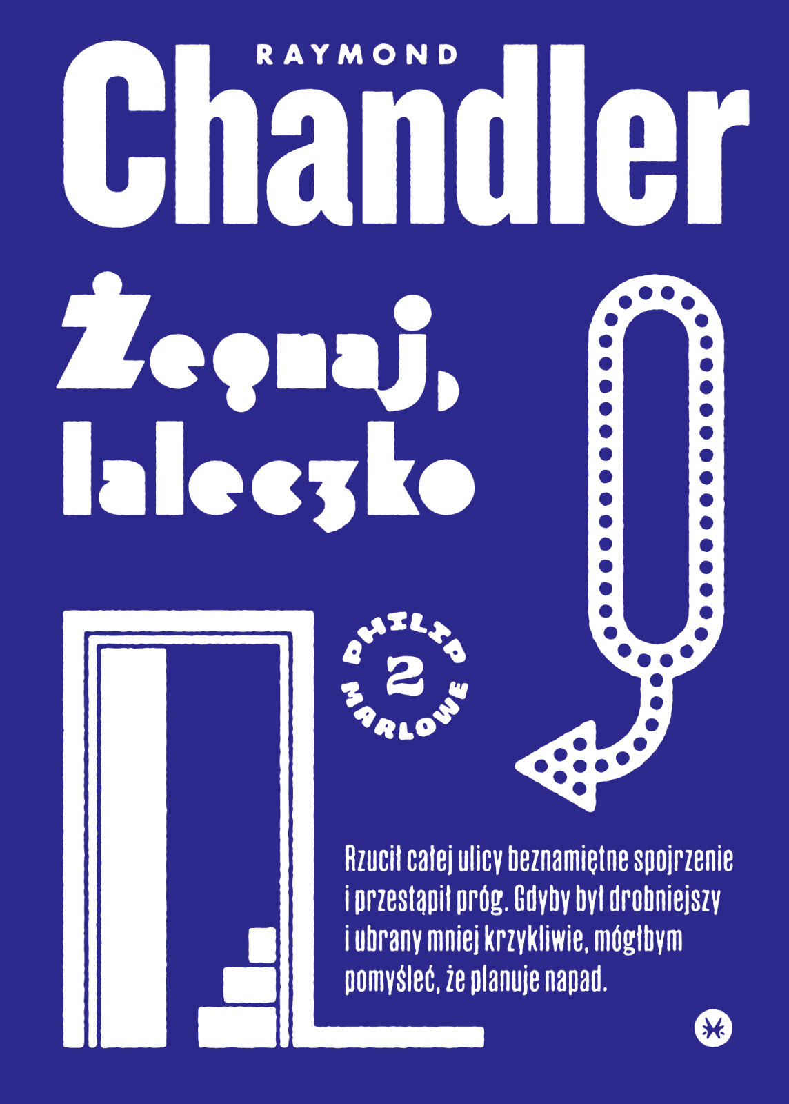
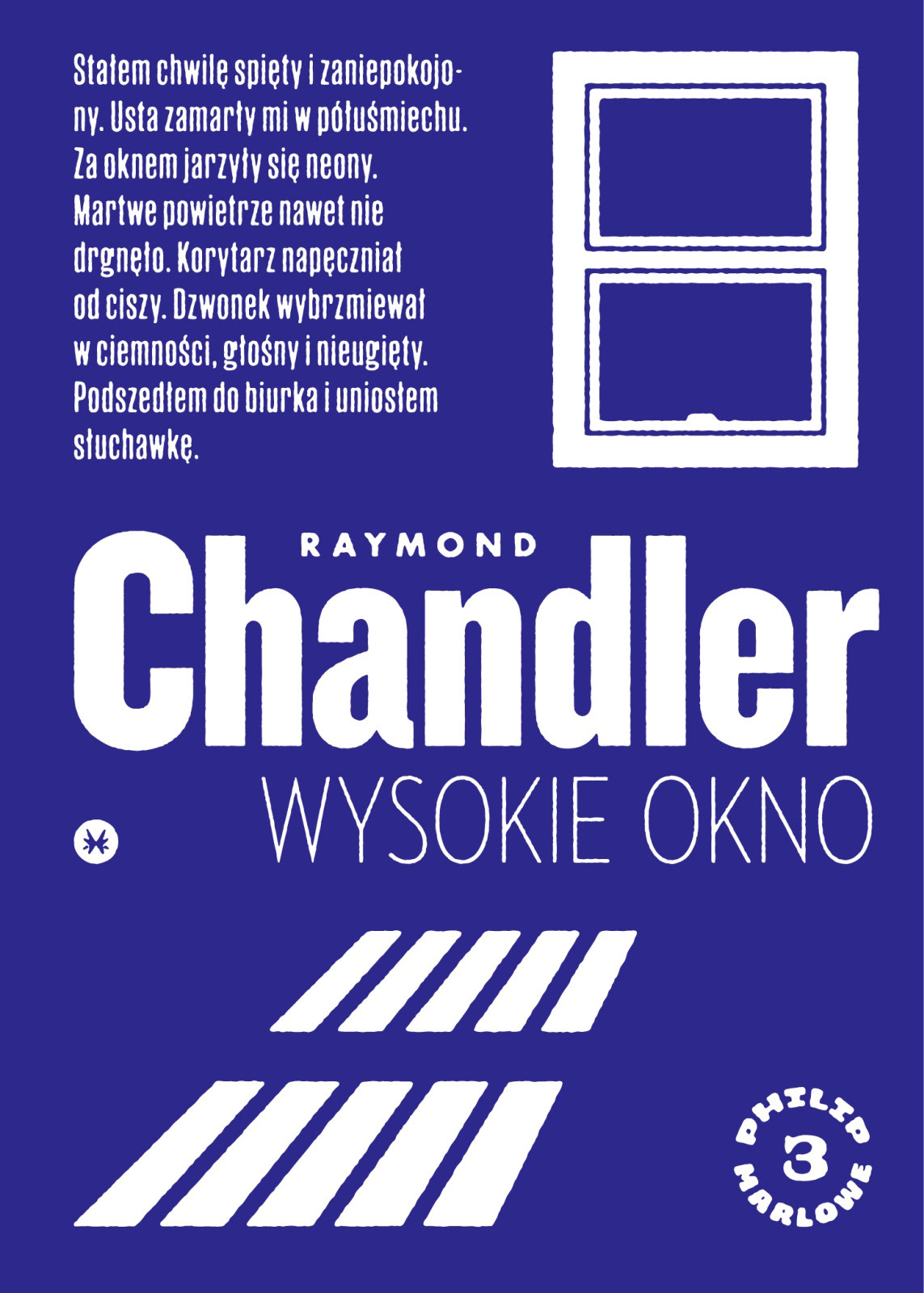
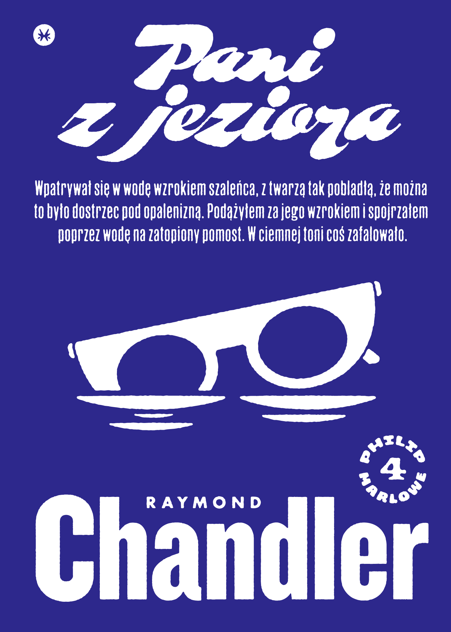
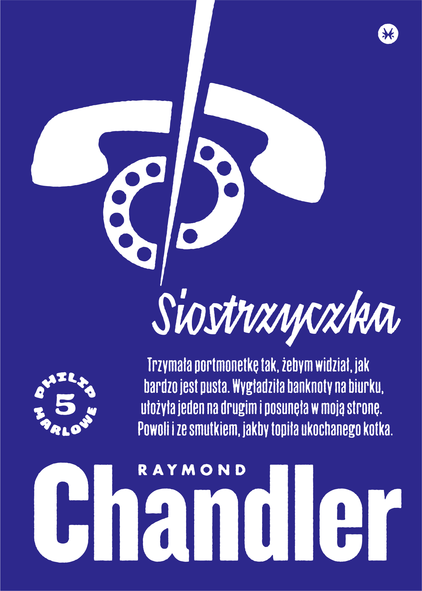
I tell you, research is pure fun. Weaving all these different threads together has become the coolest part of my job. You can probably see about 5% of it in the finished book, but knowing that IT ALL CONNECTS, that I leave nothing to chance, well, that’s something.