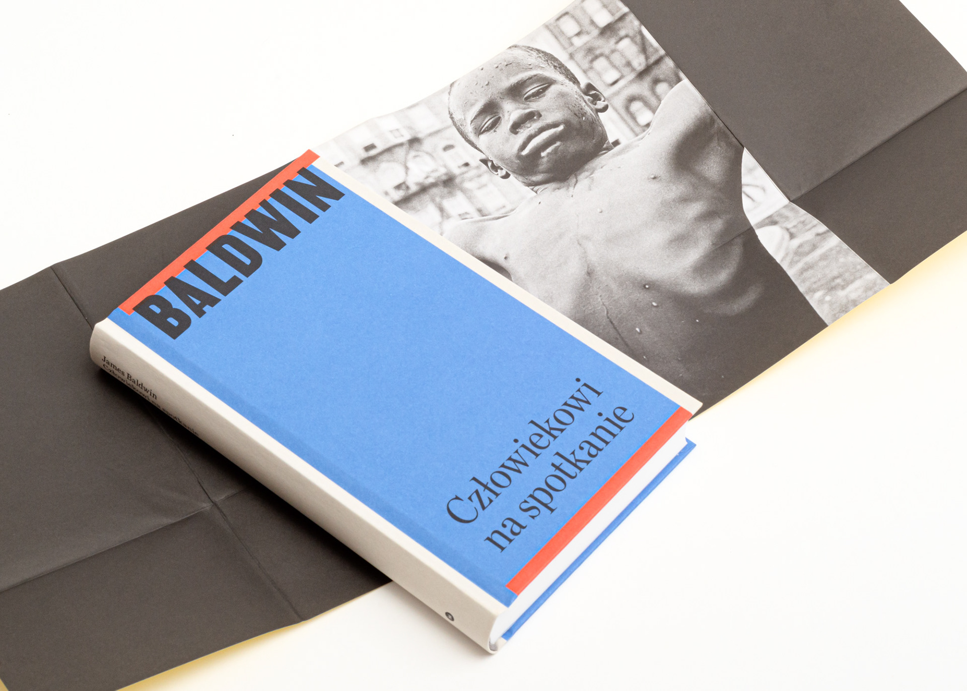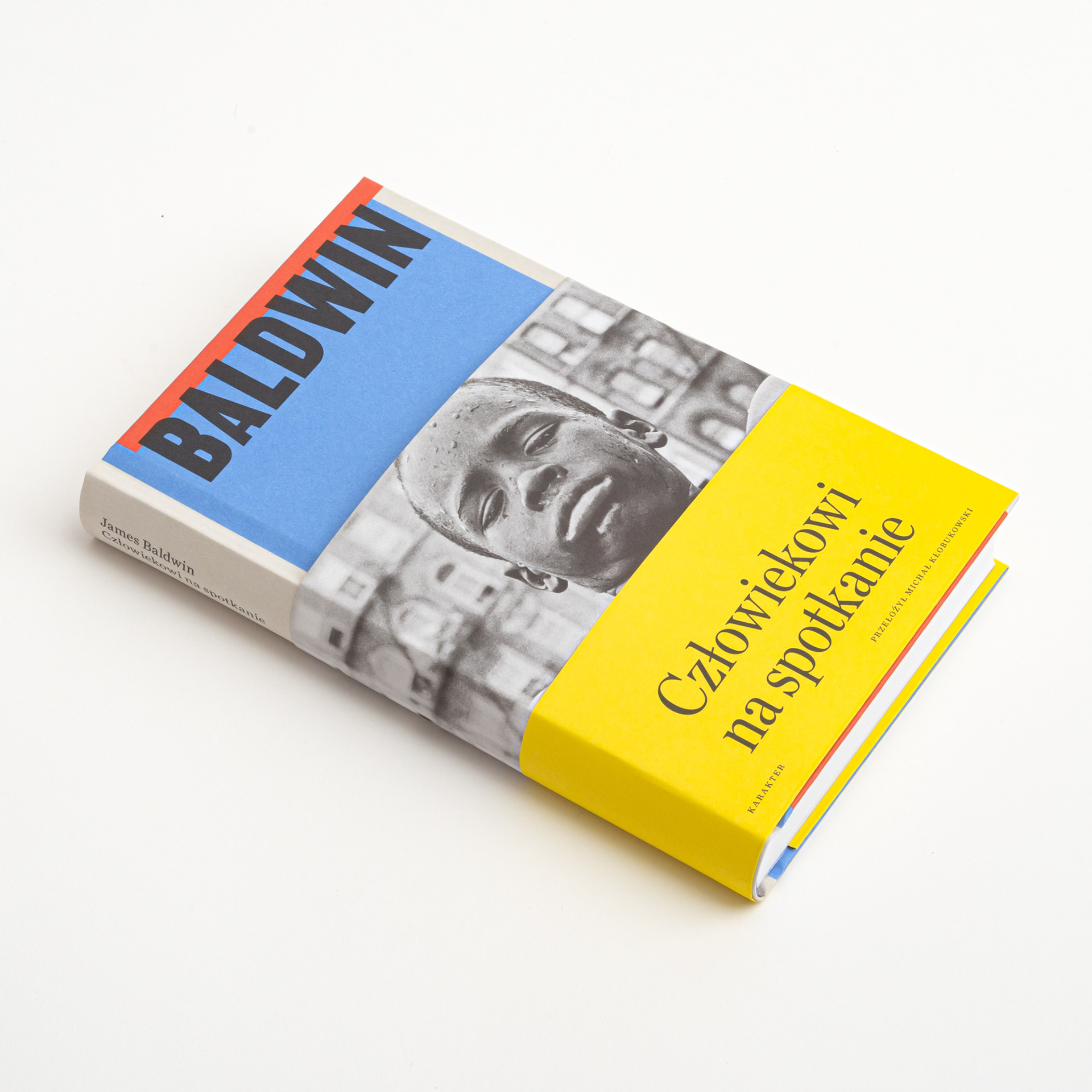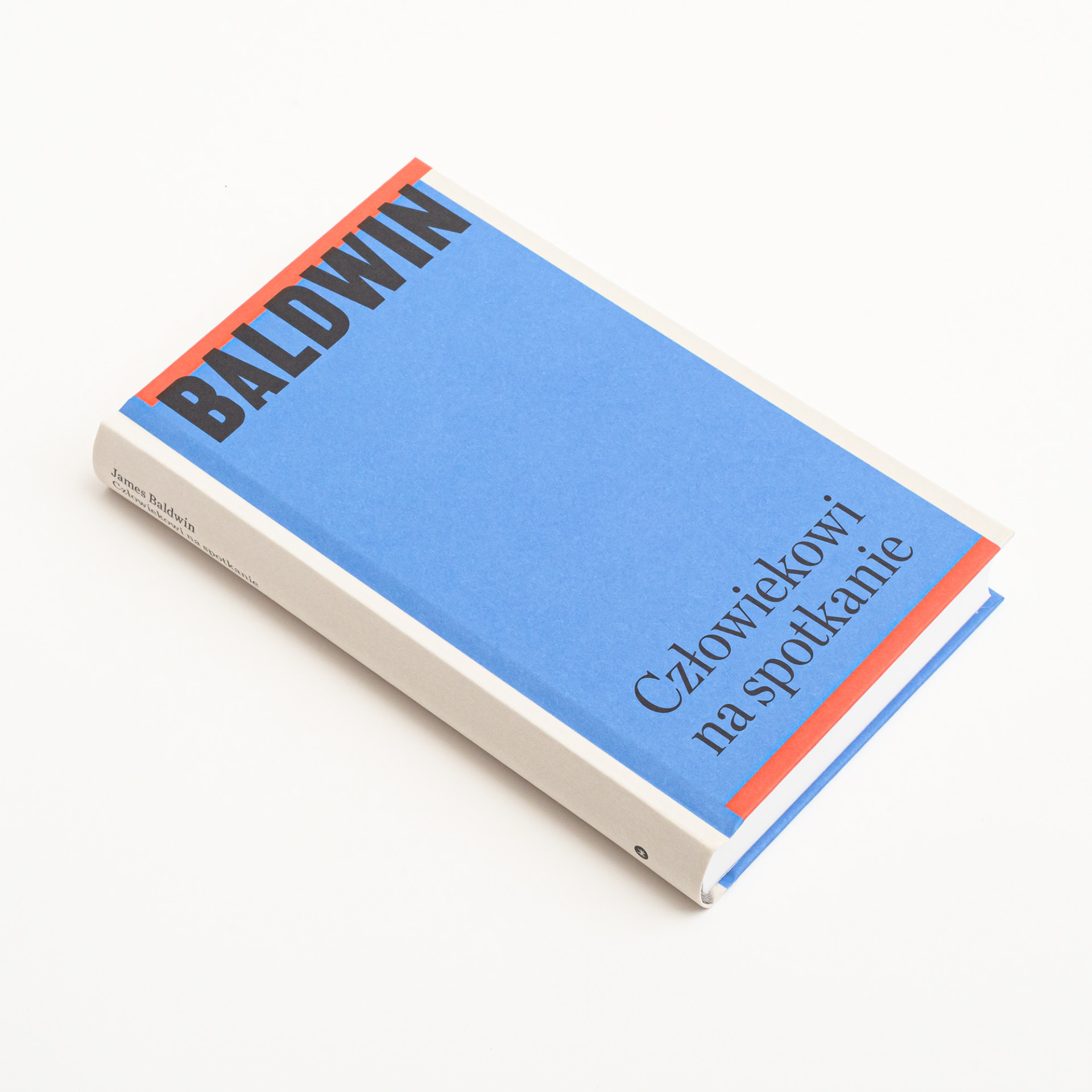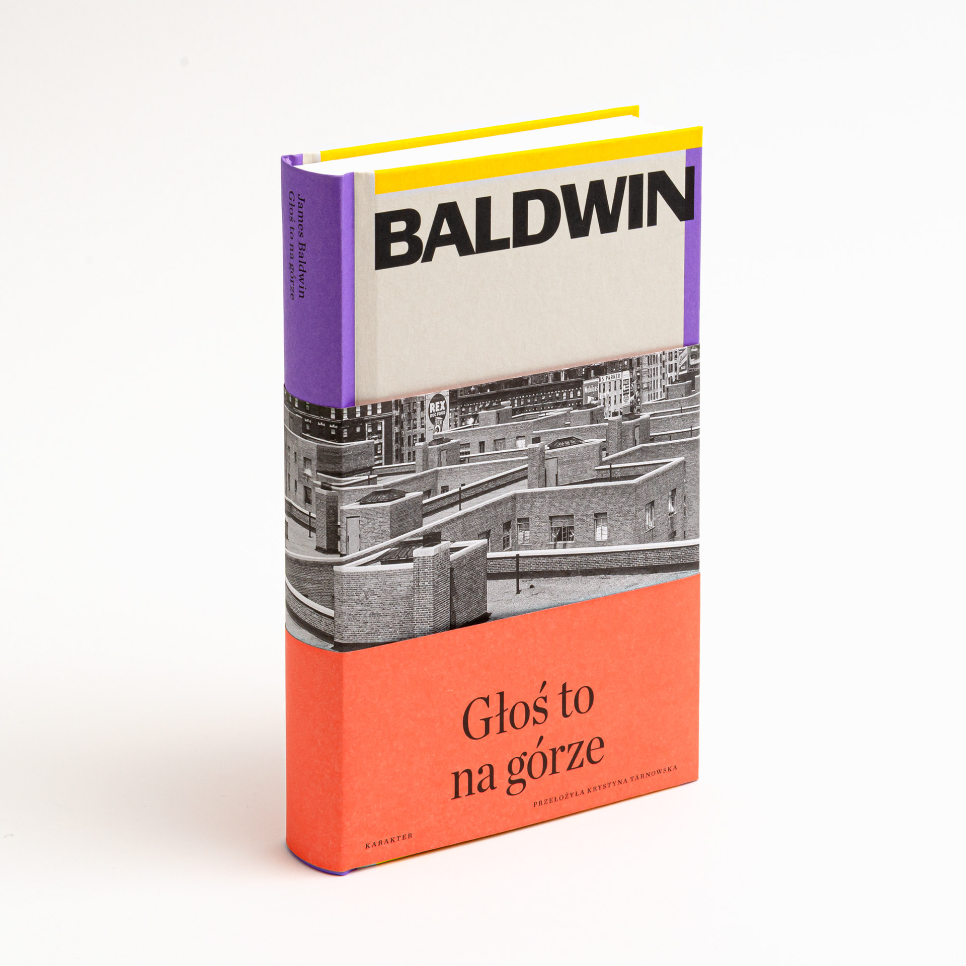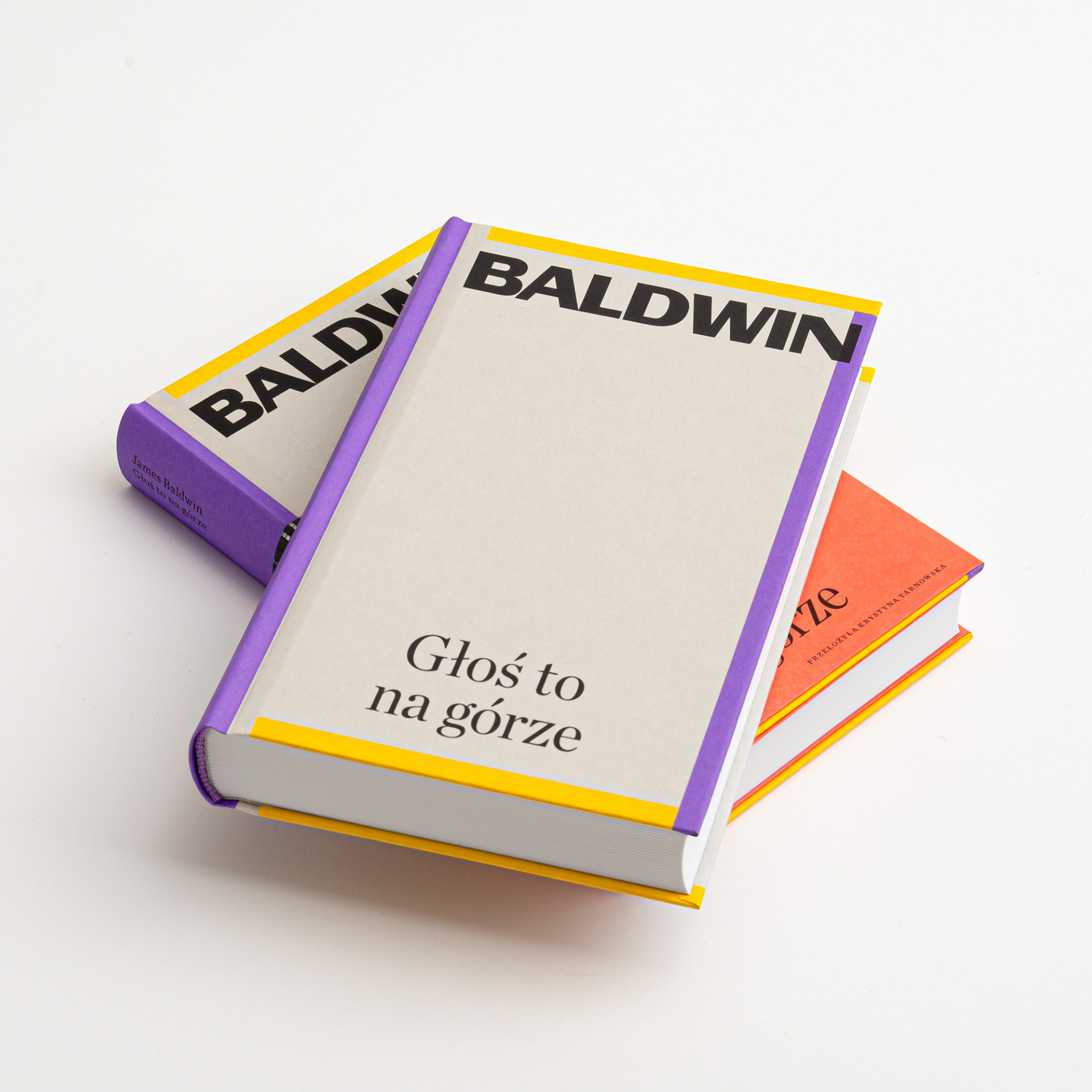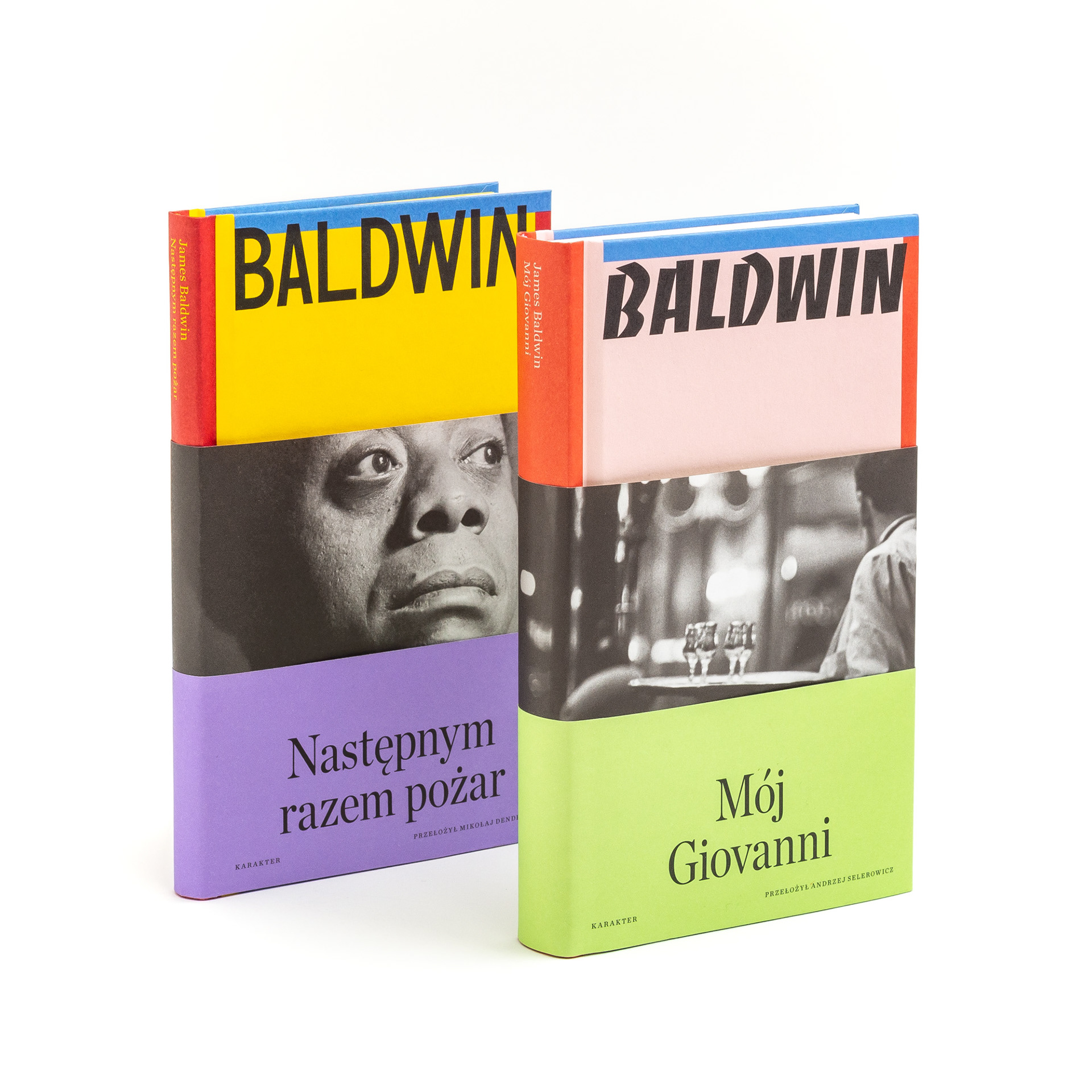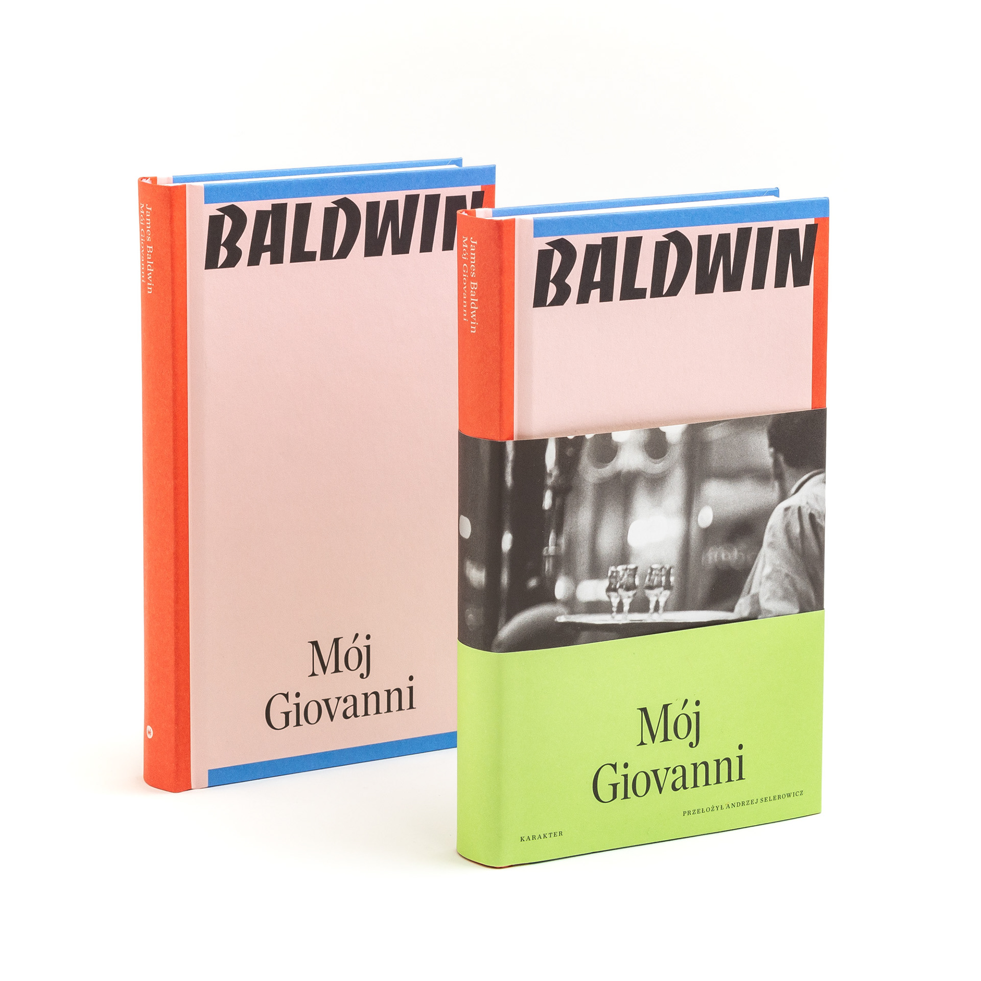
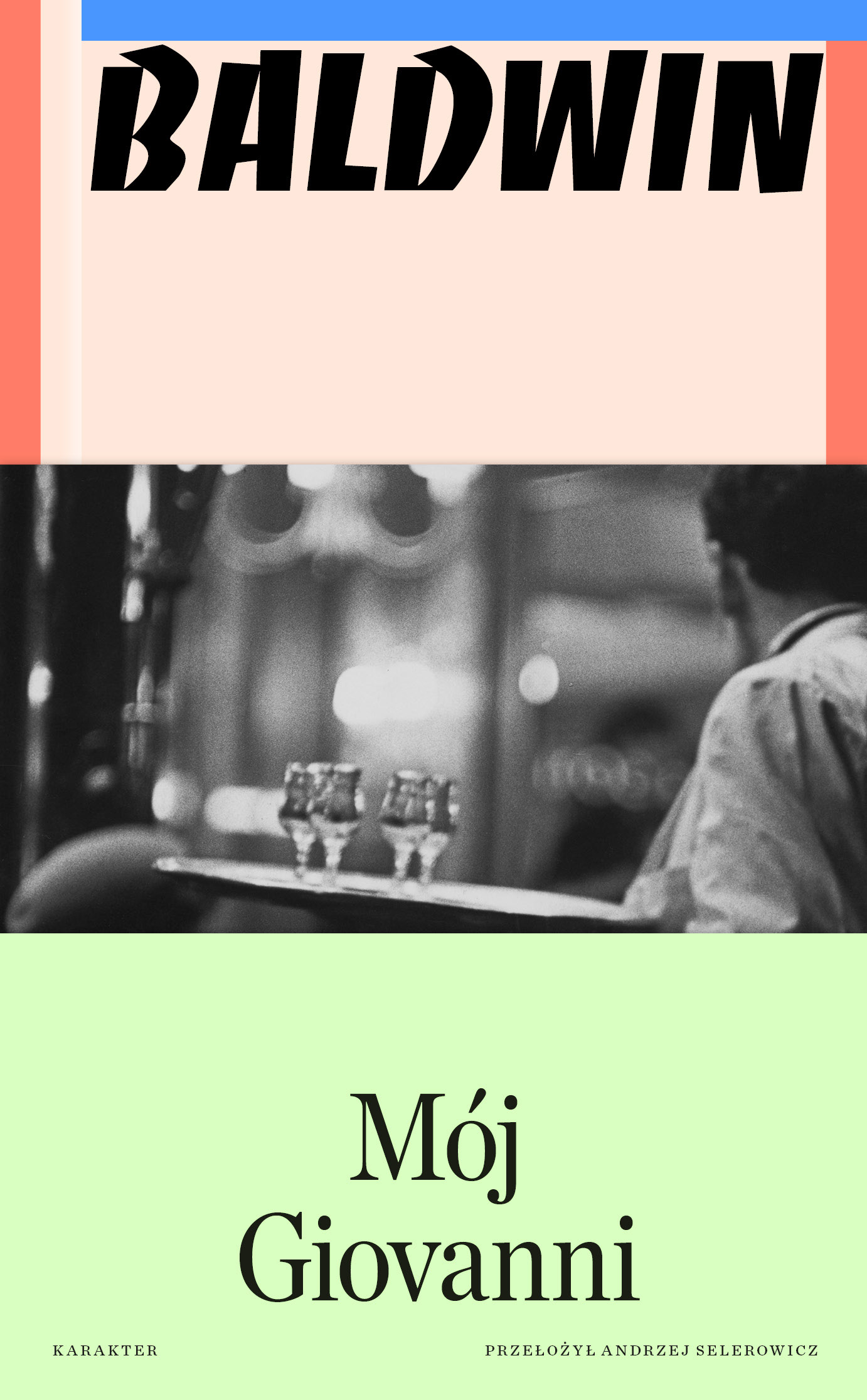
I wanted Baldwin’s books to feel unmistakably related without turning them into a rigid series. The system is built from black-and-white photography, strong colour, contrasting textures and an oversized treatment of Baldwin’s name that changes from book to book. Each volume has a folded half-jacket, so the cover is never quite a single fixed image. The outer layer crops, hides and reframes what sits underneath; opening it changes the composition. That physical shift felt right for Baldwin, whose writing constantly moves between the public and the private, the political and the intimate. The constant is his name. Its scale, position and rhythm vary from cover to cover, sometimes becoming almost an image in itself. The books clearly belong together, but they are not wearing uniforms.





Year: 2024–2025
Page size: 115×185 mm
Pages: 256–360
Paper: Munken Print Cream 15 90 g
Binding: hardcover with folded half-jacket
Cover material: Wibalin White 120 g uncoated stock
Cover material: Wibalin White 120 g uncoated stock
Typefaces: VTC Martin, VTC Bayard, Banco, Chronicle Deck, Chronicle Text (body)