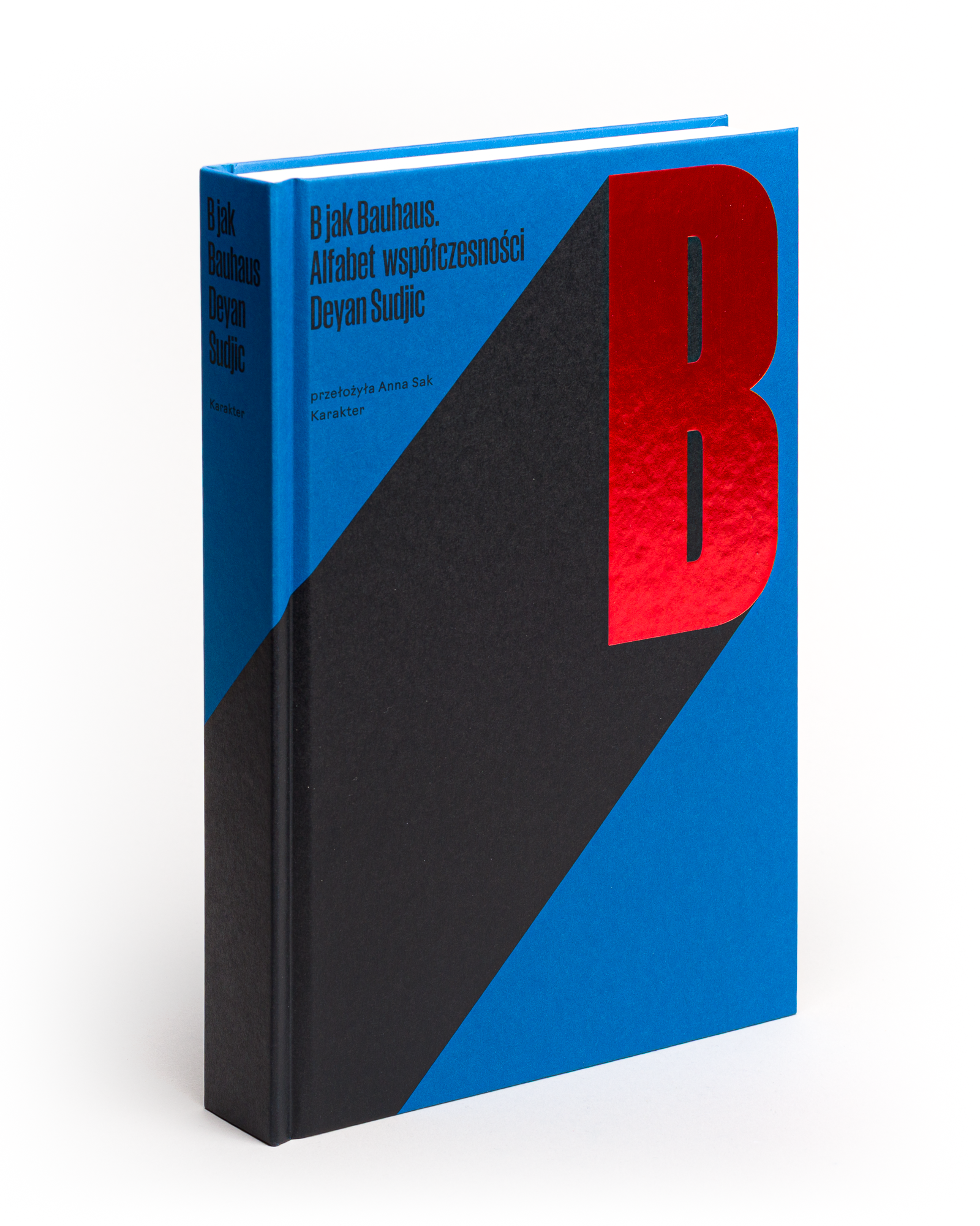
B is for Bauhaus uses the alphabet as a loose structure for a few dozen short essays on design, culture and modern life. Sudjic moves from authenticity and GTA to Dieter Rams, national identity and the strange lives of objects and ideas, usually with enough wit to make disagreement part of the fun.
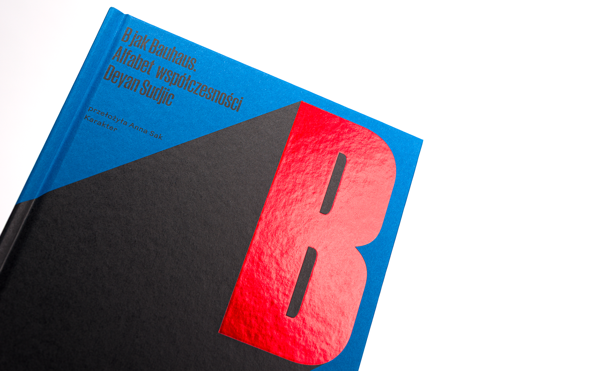
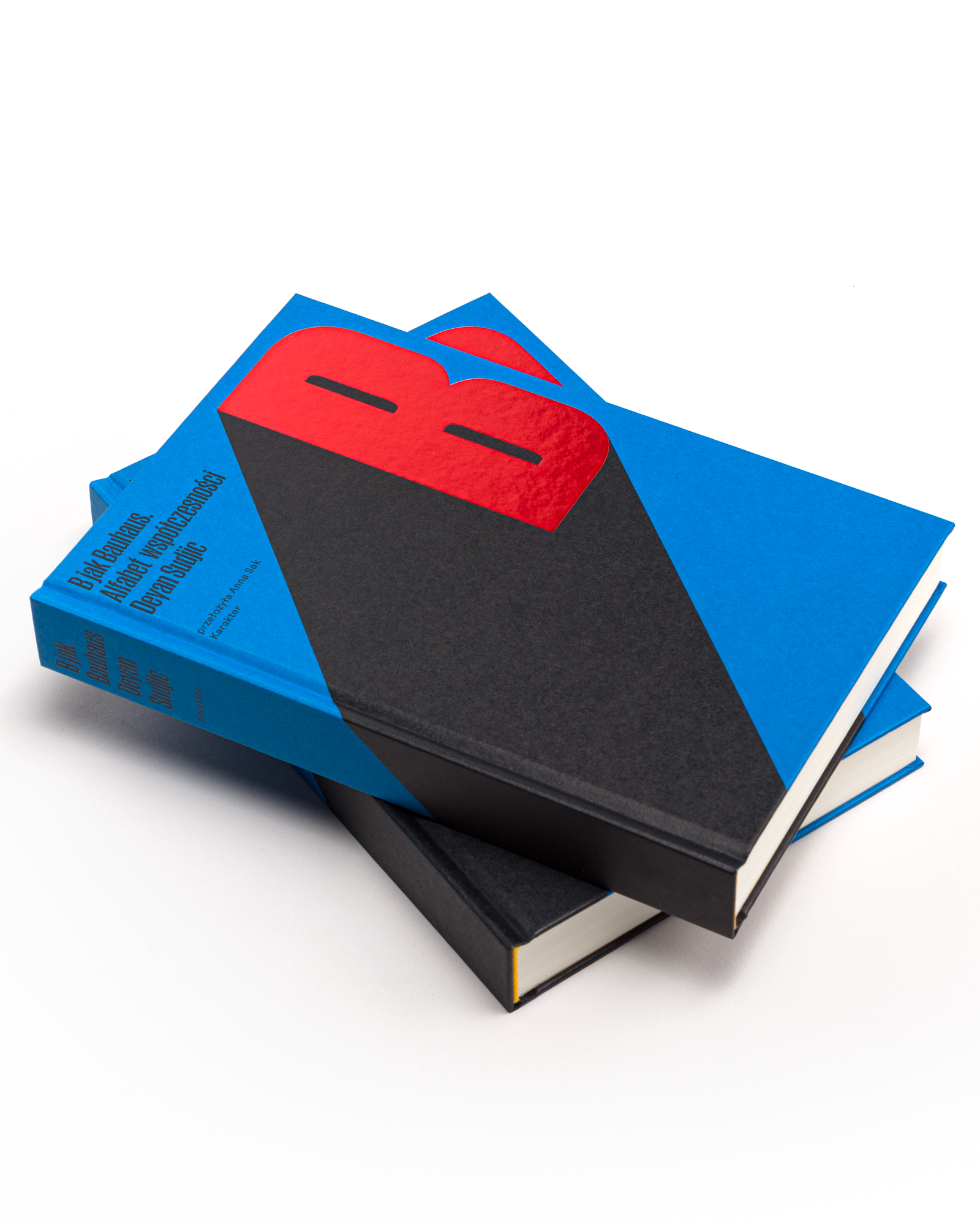
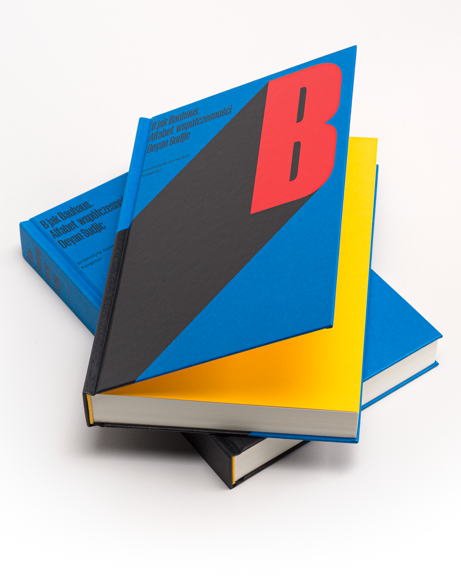
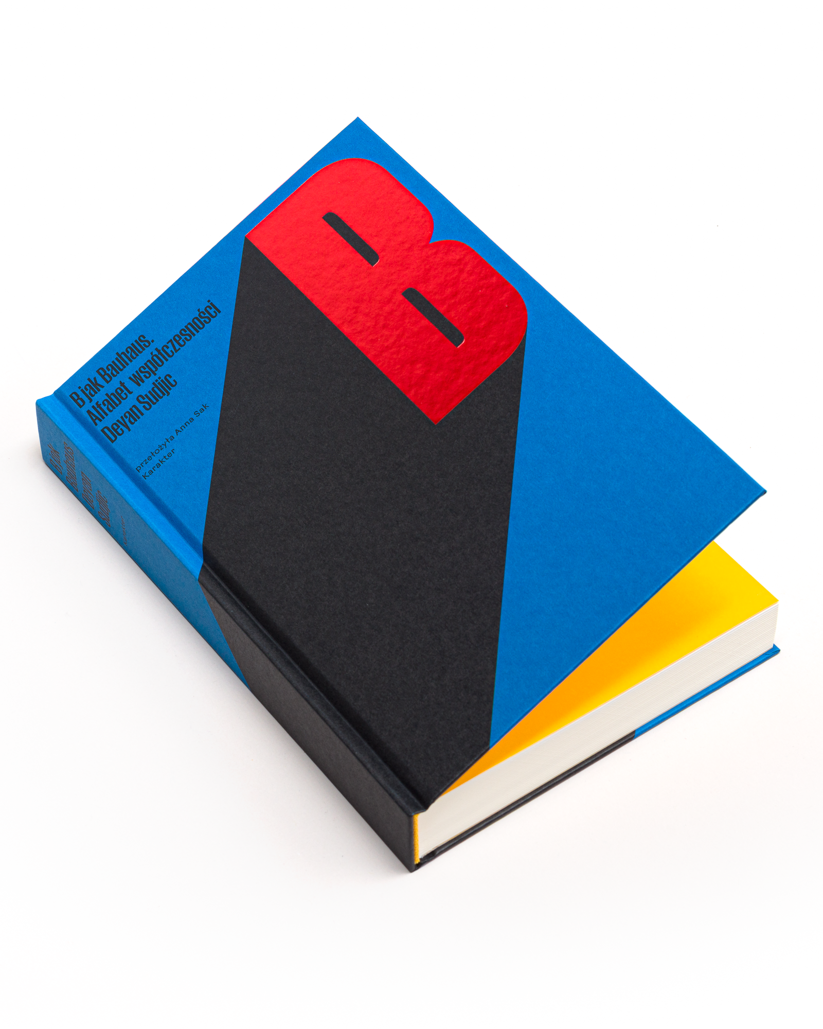
The book is deliberately mosaic-like, so I liked the idea of giving it an almost absurdly simple cover. The whole design is built from the colour of the cover paper, Geltex Azul Ceruleo, and a single black B casting an exaggeratedly long shadow. Bauhaus has been casting one over our profession for a century anyway, so making it literal felt fair. There is not much more to it, which is part of the point. A book full of dozens of names, arguments and objects ended up with a cover reduced to one letter and one gesture.
Page size: 157×237 mm
Pages: 352
Paper: Munken Print White 15 90 g
Binding: hardcover
Cover material: Geltex Azul Ceruleo 120 g
Cover material: Geltex Azul Ceruleo 120 g
Typefaces: Druk, ABC Arizona Text (body)